


Complicated and raw information becomes accessible and easier to comprehend with visuals, broadening the decision-making process and keeping it streamlined. It saves time and resources and facilitates communication by presenting visually formatted info clearly and concisely.
Evolution of Data Visualization
Its evolution over time is significant and continues to change with advancements in technology and data analytics.
Here are some ways in which data visualization changes over time and will keep changing over time:
From static to interactive:
Before, visualizing data was typically static images or charts that provided a snapshot of data at a specific point in time. However, now, they are often interactive, making room for exploration and letting users acquire insights on their own.
From basic to advanced:
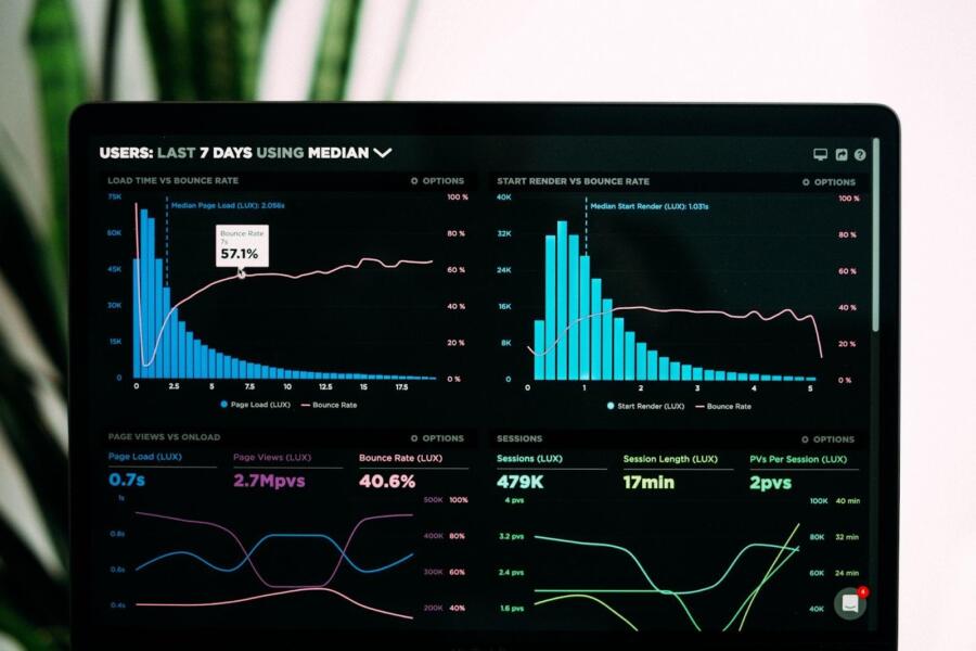
It has come from very basic to advanced visualizations. There are heat maps, tree maps, and network diagrams. These advanced types of visuals let us notice and understand the complicated nature of data easily.
From manual to automated:
Before, this was often a manual process that required significant time and effort. However, the tools we use now often automate many things in the flow.
From desktop to cloud-based:
With the rise of cloud computing, many data visualization tools are now cloud-based, allowing users to access their data its visual representation from anywhere with an internet connection. This makes it easier to collaborate with others and share insights across teams and departments.
From descriptive to predictive:
It also changes from simply describing what has happened in the past to predicting what might occur in the future. Predictive analytics and machine learning algorithms are increasingly being used to generate visuals that help streamline decisions about the future.
Overall, data visualization continues to change over time, driven by advancements in technology and data analytics. As data becomes more complex and organizations require more sophisticated insights, data visualization will likely continue to evolve to meet these needs.
How It Streamlines Decision-Making?

The use of data visualization is a potent means by which enterprises and small businesses can organize their future processes. Interpreting info visually, decision-makers can rapidly gain insights, allowing them to comprehend and analyze complex data with greater ease and efficiency:
Simplifies complex data:
It simplifies the information presented in textual or raw form and provides visuals, such as charts or graphs, which can quickly highlight patterns, trends, and outliers.
Saves time:
Data visualization can save time by providing quick and easy access to important insights. Instead of spending time analyzing large amounts of data, decision-makers can focus on the most important information presented in the visualizations.
Provides a clear picture:
Imagine presenting an infographic to a person that needs to make a decision. This lets them do it quickly by aligning the goals and significance of the information, which can lead to more informed decisions.
Facilitates collaboration:
Data visualization can help facilitate collaboration and communication across teams and departments. Visualizations can be shared and discussed among team members, leading to a more collaborative decision-making process.
Enables real-time monitoring:
KPI monitoring is still a thing, and the visuals can help people who need to make a decision monitor them in real-time. By tracking performance metrics in a visual format, decision-makers can quickly identify areas that require attention and take action as needed.
Provides a consistent view:
By standardizing the way data is presented, data visualization can provide a consistent view of information across an organization, ensuring that all decision-makers are using the same data to make informed decisions.
Conclusion
In conclusion, data visualization can streamline decision-making by simplifying complex data, saving time, providing a clear picture of information, facilitating collaboration, and enabling real-time monitoring. By adopting data visualization best practices, individuals and organizations can make more informed decisions more efficiently.
Also read: How AI and Data Analytics Can Improve Your Business


